Welcome back to my series on creating products with great impact. Please check out my first and second articles if you haven't already. In this article, I will discuss the next satellite – UX (User Experience).
Most companies have UX designers assigned to each project, so why should product managers bother learning about UX design, and how can product managers work with UX designers?
Working with UX designers
Product design starts with the requirements and user stories written by product managers. In fact, product managers begin the design process by creating low-fidelity wireframes, which then become the basis for UX designers. Therefore, it is essential for product managers to have a good understanding of UX to create the initial designs and to collaborate effectively with UX designers to complete the product design.
Every product manager needs to know the following:
· The difference between UX and UI (User Interface)
· The fundamental UX principles.
· Identify good UX vs bad UX.
Let's elaborate on each of these:
Know the difference between UX and UI
I know this is fundamental, but people tend to confuse the two.
UX defines the user journey on a page. For example, what happens when the user clicks a button on a page? What is supposed to happen, and how will the user receive feedback that they clicked the button? Something is supposed to happen, and that is what UX defines. UX is often designed using wireframes created with tools like Figma.
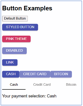
UI deals with the components used to implement the UX and the corresponding UI technology. For example, you might use React and JavaScript as the UI technologies and select a button component based on the UX design—the more interactive the UI, the better.
UX principles
These are the principles of UX that I use when designing my features.
User empathy
Put yourself in the user’s shoes. Understand your user persona and design your UX accordingly. Explore the user persona to understand their day-to-day interactions with your website. How much time do they have to complete their assigned tasks? This understanding will help you design the UX and UI accordingly.
Simplicity
A simplistic UI is essential in today’s environment. Users have short attention spans and don’t have much time to read help articles to figure out how to use a website, whether it is B2B or B2C. Don’t overcrowd the UI with too many elements.
If a complex task needs to be performed by the user, break it down into multiple simple tasks and design the UX journey to guide the user through these tasks. Simple UIs also perform well. If the UI is complex, it takes longer to render all elements, causing the performance to suffer.
Intuitive
Your UX should tell a story. It should not be a collection of disconnected elements. Where possible, use guided UI to make it easy for the user to follow. Use visual markers, such as button colors, to draw attention to what the user needs to do. Implement in-product messaging to guide the user. Essentially, the user should not need to refer to a help video to navigate the UI.
Create Aha factor
Make your UI so easy to use that users remember the pleasant experience. Such users will recommend your website to others, contributing to product-led growth.
Know your UI elements. As a product manager, stay updated on the latest UI elements and integrate them into your company’s UI layer. Strive to keep your UI as current as possible.
Some of the UI elements that are popular in 2024 are below: Carousel, Card, Breadcrumb, Bento Menu, Hamburger, Alt Burger, Meat ball, Kebab, Doner. Some of these elements are shown through pictures below.

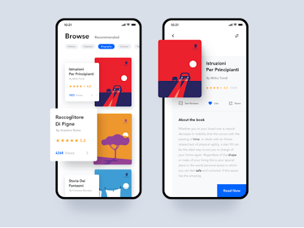

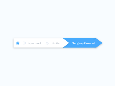
There are more like Accordion, Button, Check Box, Comment, Doner menu, Dropdown, Feed, Form, Hamburger menu, Icon, Input field, Loader, Meatballs menu, Modal, Notification, Pagination, Picker, Progress Bar, Radio Buttons, Search field, Sidebar, Slider Controls, Stepper, Tag, Tab Bar, Tooltip, Toggle. Get more details here.
Knowing the UI elements helps you visualize the UX/UI even before designers begin developing the design. You can proactively participate in the UX flow as well as UI design.
Know good UX from bad UX
When your design team suggests ideas, try to understand the design from the user’s perspective. Apply the UX principles listed in the previous section and see if the UX follows those principles.
Another way to distinguish good design from bad is to conduct user research to gauge the time users take to complete the task and collect qualitative feedback.
Let me compare the UX and UI of two websites I encountered recently. Both of them are to sell used good. The first one is called Quikr and the second one Zoopie.
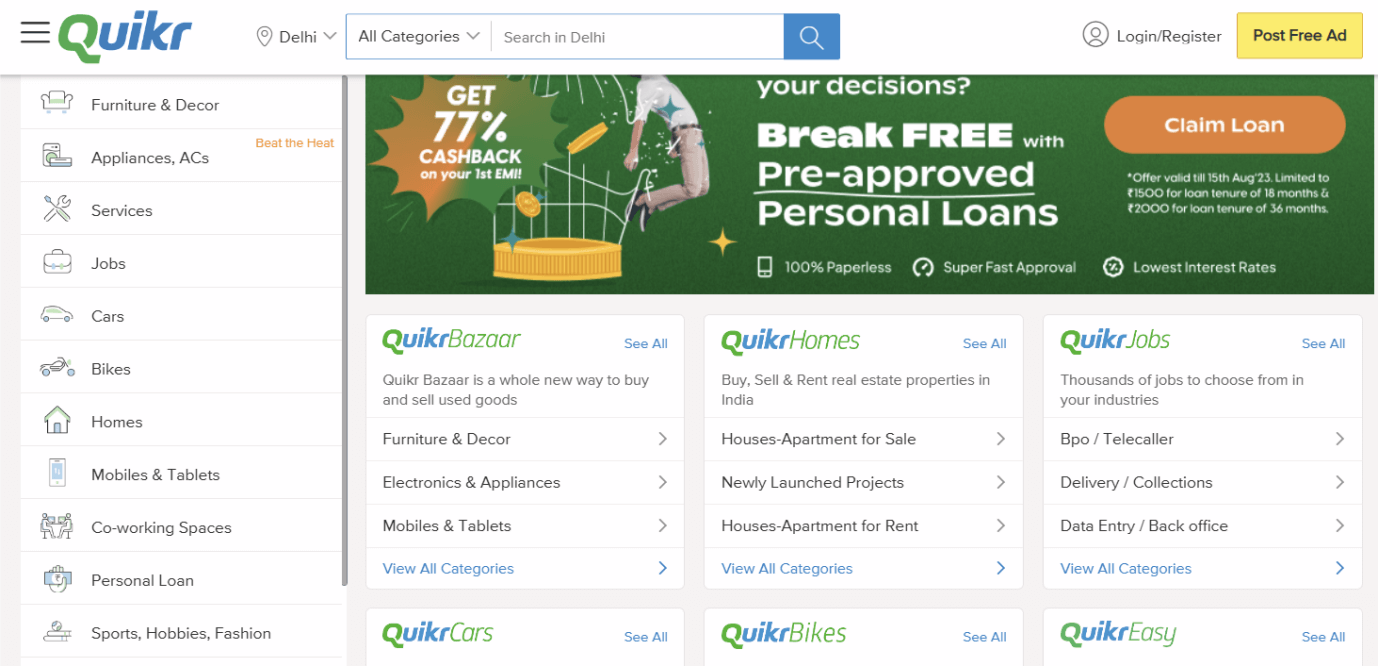
Their homepage is cluttered with too many links, lacking clear demarcation of categories. They could improve by using tabs to group related categories and keeping the homepage simple.
Zoopie is another website that sells used furniture.
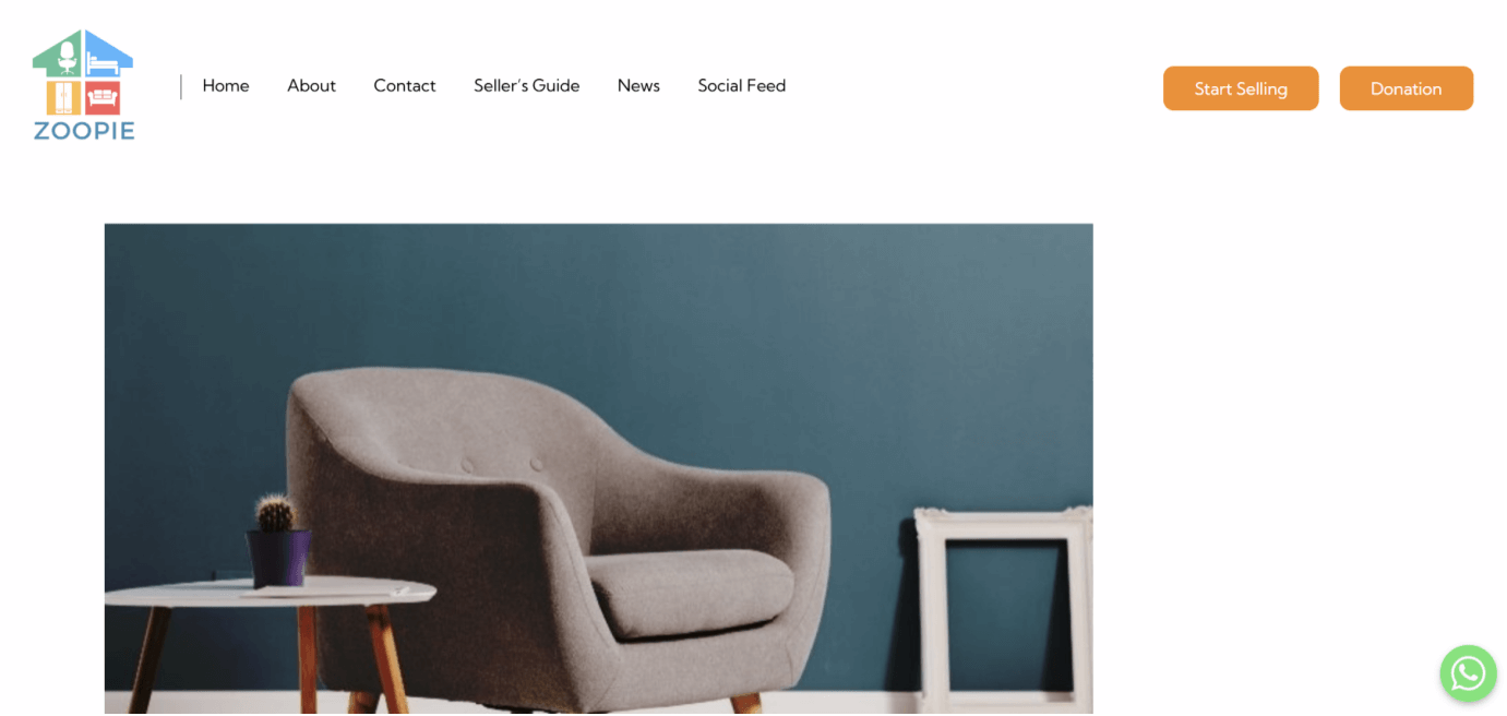
Their home page is minimal, visually appealing and the call to action clearly attracts towards “Start Selling” and “Donation” with a contrast color Orange.
When you click on Start Selling, you see the following:
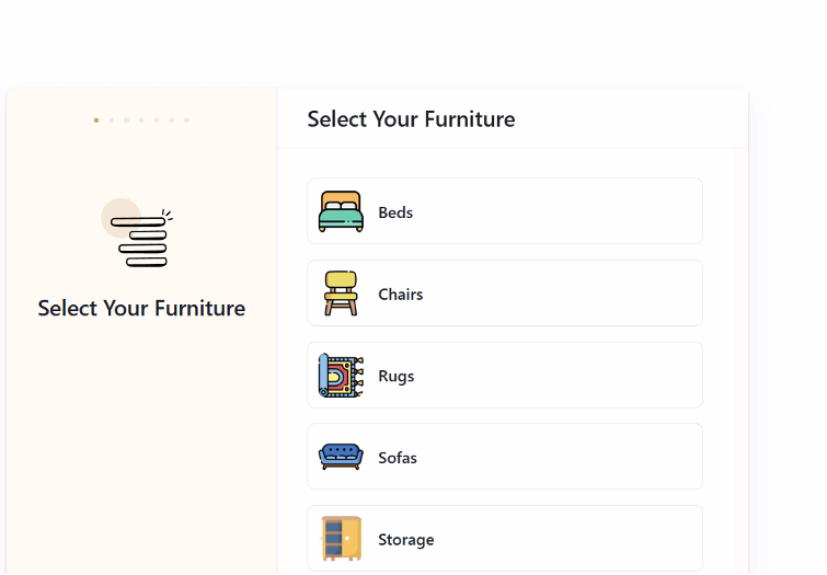
Even on the above page, many visual cues are used to catch the user’s attention, and the page remains minimal.
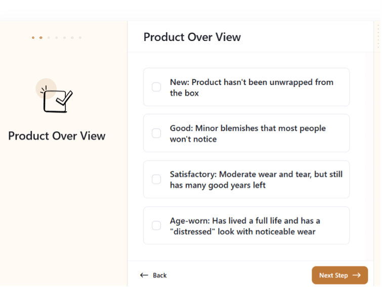
It is a guided flow. The dots at the top show how many steps need to be completed. The choices given on the screen are clear and easy to understand.
In the next step, they give a minimalist UI with clear UI components for uploading photos. The flow continues further in this manner. Every PM should strive for such UX, and when they see a design proposed by UX designers, they should be able to identify if the UX is following the key principles and work closely with UX to achieve the desired design.
Remember the following points when evaluating your design:
Learnability: How easy is it for users to get to grips with your product the first time they use it? Things like consistency and information architecture can enhance the learnability of a product.
Efficiency: Does the design of the product allow the user to complete their desired tasks quickly and efficiently?
Memorability: When users come back to the product after a while of not using it, is it easy for them to re-familiarise themselves with how it works?
Errors: How many errors do users typically make when using the product and how severe are these errors? Is it easy for users to recover from errors? This relates to the principle of user control.
Satisfaction: Is it pleasant and enjoyable for users to engage with the product? Does it provide a satisfying user experience, or a frustrating one?
Learning
I am always a fan of product managers taking courses related to any discipline that can make them more effective.
Free Courses:
Paid Courses:
Now, you know how product managers can work alongside UX designers to build great products. Remember, collaboration creates the best results when designing products.
Feeling stuck when it comes to sales? We've all been there. But fear not! We've got the goods to push your sales game to the next level.
Welcome to our exclusive ebook on product-led sales – your ultimate guide to mastering the art of selling products in today's competitive landscape.


 Follow us on LinkedIn


