Key screens are the interfaces that convey the essence of your product or service. Wireframing your product’s key screens should be the first pass of your interface design, making the highest priority screens the most visible in your first version of the design document.
Ask yourself, “what are the screens that are essential to our product that make it unique from another product?” Don’t think of login or register screens at this point (unless you are a security firm 🙂). This could be just a couple of screens, 1 or 2, or maybe 10. The important thing to think about is what makes your product different.
Where do I get the key screens?
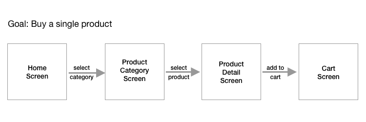
One trick is to think about the goal or goals you want people to achieve on your website. Then, think through the flow of how you want that person to accomplish each goal. You start with what we call the happy path. This is the best case scenario where someone accomplishes the goal you want them to achieve using your website or app.
If you are still stuck, try thinking about the specific problem you are trying to solve for the people who will be most affected by your idea. What information needs to be conveyed to them and/or collected from them?
Your low-fidelity wireframes should capture the essence of the conceptual experience, but not all the detailed interactions at this point.

Let's break this user flow down a bit more. The boxes represent what the user sees on the screen. The arrows represent what a user does after viewing that screen. Notice that at this point, there are no UI elements seen. Notice that we don't say "click on this button" or "fill out this field."
We haven't figured that out yet. We just want to know what the purpose of each screen is at this point. We can decide if we need more or fewer screens to help the user down the happy path. You can do this work with pen & paper, on a whiteboard, or in Balsamiq.
Process for discovering key screens to wireframe
- Idea
- The goal for people to accomplish
- The happy path, or paths needed to accomplish that goal
- Low-fidelity wireframes of those key screens
Why use key screens?
Why not just start on the homepage and go screen by screen from there? Starting with the home screen is definitely a great idea. But sometimes it can feel a bit overwhelming. It's the "front door" of your website/app.
It requires a lot of thinking and iteration. You'll need to do that at some point. However, it might be a bit easier once you get the guts of your website or app a bit more fleshed out.
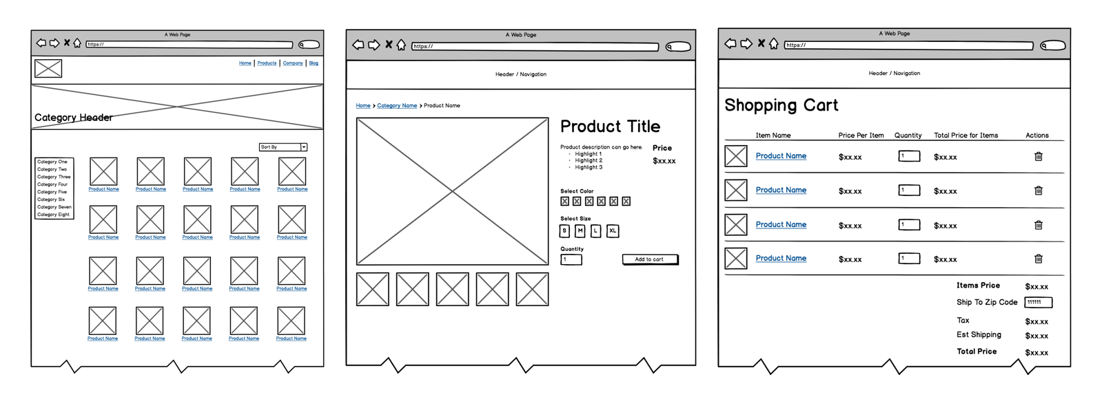
Let's say you are creating an e-commerce website/app. One of the key screens will be your product detail page. What are you selling? Start with the unique aspects of that and what information should be displayed on that screen to help a customer make a decision. What other key screens might there be? Well, the shopping cart for one. How can your shopping cart make checking out as easy as possible? There are standard UX and UI patterns for shopping carts, so definitely take advantage of those.
For a small e-commerce shop, the key screens would be:
- Category page
- Product detail page
- Shopping cart page
That's three key screens. Really focus on those and make them the best they can be.

Summary
Key screens primarily come from the happy user path, where a person accomplishes their primary goal on your website or app. You may have a couple of goals for your website. That is okay. Just make sure those key screens are as top notch as they can be.


 Follow us on LinkedIn


